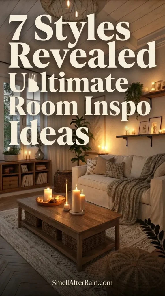

- The Paradox of Modern Design: Why Your Room Feels Soulless
- Mistake #1: The "Showroom" Syndrome (Sterility vs. Minimalism)
- Mistake #2: The One-Dimensional Texture Trap
- Mistake #3: Lighting Malpractice (The Single Overhead Source)
- Mistake #4: The "Fast Fashion" Furniture Fallacy
- Mistake #5: Ignoring Scale and Proportions in a Master Suite
- Mistake #6: The Color Fear (Why Beige isn't the Only Answer)
- Mistake #7: Neglecting the Sensory Experience
- The Final Edit: Curating a Timeless Sanctuary
There is a pervasive misconception in the world of interior design that equates “modern” with “empty.” When homeowners scour Pinterest for modern bedroom ideas, they are often met with images of stark, white boxes that look more like surgical theaters than places of rest. This is the great paradox of contemporary aesthetics: in the pursuit of a clean, uncluttered life, we often strip away the very soul of the home. A true modern luxury bedroom is not about the absence of things; it is about the presence of the right things. It is a curatorial exercise in balance, warmth, and intentionality.
If you have ever walked into your bedroom and felt that it lacked character, or worse, that it felt uninviting despite having brand new furniture, you are likely falling victim to common design pitfalls. This is not just about aesthetics; it is about psychology. Your environment dictates your mood, your sleep quality, and your mental clarity. In this critical analysis, we are going to dissect the specific errors that turn a potential luxury bedroom master suite into a generic hotel room, and more importantly, how to fix them with sophisticated design principles.

The Paradox of Modern Design: Why Your Room Feels Soulless
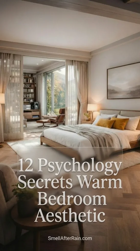
Before we dive into the specific mistakes, we must address the philosophy behind the aesthetic. The best bedroom design styles today are hybrids. They take the clean lines of mid-century modernism, the raw materials of industrial design, and the softness of Scandinavian hygge. The goal is a warm bedroom aesthetic that breathes. When you browse bedroom ideas, look beyond the geometry. Look at the feeling. Real modernism is not rigid; it is fluid.
Many amateur designers mistake “sleek” for “shiny” and “minimal” for “barren.” This leads to spaces that photograph well but feel terrible to live in. We need to move away from the catalog look and towards a lived-in, authentic luxury. As we explore these seven fatal errors, keep in mind that the solution is almost always about adding depth, layer, and humanity back into the space.

Mistake #1: The “Showroom” Syndrome (Sterility vs. Minimalism)
The most egregious offense in modern bedroom interior design is the creation of a space that feels untouched by human hands. This is often the result of taking the concept of a minimalist bedroom too literally. You clear the surfaces, you paint the walls stark white, and you buy furniture with sharp, harsh lines. The result is a room that echoes—both acoustically and visually.
The Fix: The “Undone” Element
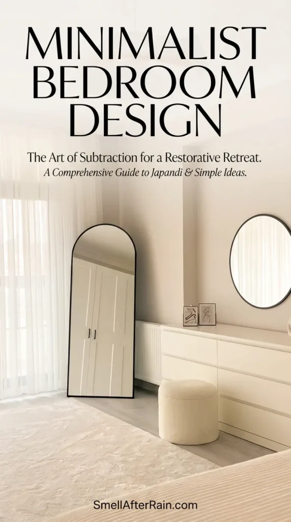
Perfection is boring. To fix a sterile room, you need to introduce organic irregularity. This is often referred to as wabi-sabi in Japanese aesthetics—finding beauty in imperfection. Instead of a tightly tucked hospital corner on your bed, opt for relaxed linen bedding that drapes naturally. Introduce organic shapes; if your bed frame is rectangular, your nightstands or rugs should have curves. You can read more about balancing these elements in our guide to minimalist bedroom design.
Furthermore, bring nature inside. A large, sculptural plant (like a Ficus Audrey or a large Olive tree) introduces fractal patterns that our brains are hardwired to find soothing. The “showroom” look fails because it lacks life. A minimal bedroom should feel like a sanctuary, not a vacuum.

Mistake #2: The One-Dimensional Texture Trap
A room can have a monochromatic color palette and still feel incredibly rich, provided there is textual diversity. One of the most common mistakes in modern bedroom designs is matching the finishes too closely. High-gloss lacquer furniture on a hardwood floor with a thin cotton rug creates a “flat” visual experience. There is no friction, no shadow play, and no tactile interest.
The Fix: The Rule of Three Textures
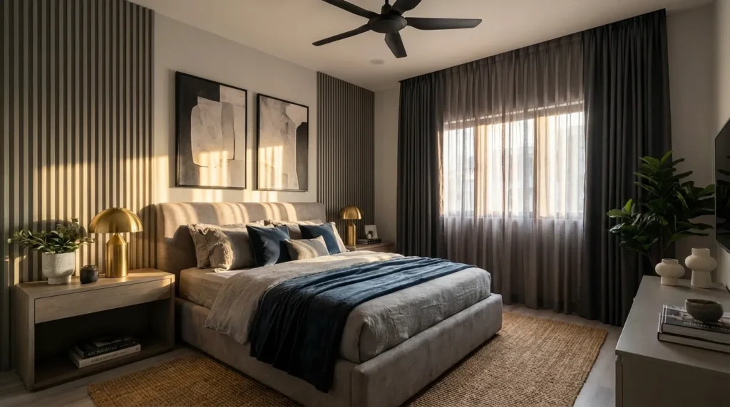
To achieve a modern luxury bedroom vibe, you must layer contrasting materials. If your headboard is velvet (soft/absorbent), your nightstand should be wood or stone (hard/reflective), and your bedding should be linen or washed cotton (matte/organic). This interplay catches the light differently throughout the day.
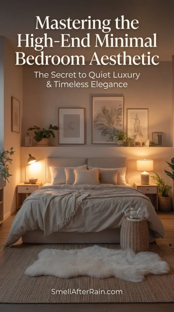
Consider a boucle armchair in the corner to contrast against smooth walls. Use a rug with a high pile or a knobbly wool texture to ground the space. This is the secret to mastering the high-end minimal bedroom aesthetic. It is not about buying expensive things; it is about buying things that feel different to the touch. The visual weight of these textures fills the room without cluttering it.

Mistake #3: Lighting Malpractice (The Single Overhead Source)
Nothing kills a mood faster than a single, bright overhead light fixture. This is the “interrogation room” effect. In a bedroom, lighting serves three purposes: ambient (general visibility), task (reading), and accent (mood). Relying on one ceiling flush mount flattens the room and casts unflattering shadows. It makes even the most expensive furniture look cheap.
The Fix: Layered Illumination
You need at least three distinct light sources at different elevations. First, eliminate the usage of “daylight” (5000K+) bulbs; they belong in garages, not bedrooms. Stick to 2700K or 3000K for a warm, inviting glow.
- Low Level: Use floor lamps or uplighting behind a plant to cast shadows on the ceiling.
- Mid Level: Bedside lamps or low-hanging pendants frame the bed and provide intimacy.
- Eye Level: Sconces with dimmers allow you to control the atmosphere.
For those looking to create a truly dreamy bedroom idea, consider installing LED strips under the bed frame or behind the headboard for a floating, ethereal glow. Lighting is the invisible paint of your interior; use it to highlight architectural details and soften hard edges.

Mistake #4: The “Fast Fashion” Furniture Fallacy
In an era of instant gratification, many homeowners fill their rooms with particleboard furniture that mimics modern design but lacks substance. These pieces often have poor proportions, cheap hardware, and synthetic finishes that off-gas VOCs. A luxury bedroom master suite cannot be built on a foundation of disposable furniture. It lacks the visual weight and gravitas required for a truly modern aesthetic.
The Fix: Invest in Anchor Pieces
You do not need to blow your budget on every item, but the bed frame and the mattress are non-negotiable anchor pieces. A solid wood or high-quality upholstered bed frame grounds the room. It signals permanence and stability. Vintage shopping is also a fantastic way to find high-quality construction (dovetail joints, solid oak) at a lower price point. Mixing a vintage mid-century dresser with a contemporary bed creates a sophisticated, curated look that defies the “catalog” feel.
For more on avoiding these specific pitfalls, read our analysis of 7 fatal bedroom design mistakes. The goal is to curate a collection, not just fill a cart.

Mistake #5: Ignoring Scale and Proportions in a Master Suite
Scale is the silent killer of design. A common issue in modern bedroom interior planning is the “postage stamp rug”—a small rug floating in the middle of the room or just at the foot of the bed. Conversely, oversized nightstands next to a low-profile platform bed look clumsy. When the scale is off, the room feels uneasy, even if you can’t immediately pinpoint why.
The Fix: The Anchor Rule
Your rug should be large enough that the bed and the nightstands sit entirely on it, or at least the bottom two-thirds of the bed. In a standard master bedroom, this usually means an 8×10 or 9×12 rug. The rug acts as an island, unifying the furniture into a cohesive zone.
Similarly, pay attention to the height of your nightstands relative to your mattress. In modern design, they should be level with or slightly lower than the top of the mattress. Vertical scale matters too; if you have high ceilings, low-slung Italian furniture might get lost. You need vertical elements—tall curtains hung from the ceiling line, or tall art—to bridge the gap.

Mistake #6: The Color Fear (Why Beige isn’t the Only Answer)
While neutral palettes are a staple of minimalist bedroom styles, fear of color often leads to the “greige wash.” A room that is entirely grey or beige can feel muddy and depressing without adequate contrast. Many people are afraid to break the neutral palette because they fear it won’t look “clean.”
The Fix: Tonal Depth and Moody Accents
You don’t need to paint the walls bright red. Instead, explore the depth of neutrals. Charcoal, slate, espresso, and forest green act as neutrals in a modern context. Painting a wall (or even the ceiling) a deep, moody hue can actually make a room feel larger and more infinite, blurring the boundaries of the corners.
If you prefer light walls, ensure your furniture provides high contrast. A black oak bed frame against a cream wall is striking and undeniably modern. This contrast creates a focal point. For inspiration on balancing light and dark for a cozy vibe, check out creating a cozy minimalist sanctuary.

Mistake #7: Neglecting the Sensory Experience
Finally, modern design is often criticized for being “cold” because it focuses purely on the visual. However, a bedroom is a sensory experience. It is about how the sheets feel, how the room smells, and the sound of the silence. Neglecting these invisible elements is why some “perfect” rooms feel uncomfortable.
The Fix: The Invisible Architecture
Sound dampening is crucial in a modern room with hard surfaces. Heavy drapery (velvet or thick linen) helps absorb sound, creating that hushed, hotel-like atmosphere. Scent is also a design element. Use a diffuser with cedarwood, bergamot, or lavender to layer a signature scent into the space. This triggers the brain to switch into “rest mode.”
At Smell After Rain, we believe that the atmosphere is just as important as the furniture. The ultimate warm bedroom aesthetic engages all five senses.

The Final Edit: Curating a Timeless Sanctuary
Creating a modern bedroom that stands the test of time requires a critical eye. It requires the discipline to say “no” to trends that don’t serve the function of the room. It demands that you look past the glossy images of modern luxury bedroom editorials and ask: “How does this room function? How does it feel?”
By avoiding the showroom look, layering rich textures, mastering your lighting, investing in quality, respecting scale, embracing contrast, and engaging the senses, you transform a sleeping space into a restoration chamber. Modern design, when done correctly, is the ultimate luxury because it removes the unnecessary to make room for the essential. It is not about living with less; it is about living with better.
Take a hard look at your current setup. Which of these mistakes are you making? The fix might be as simple as a new lightbulb or as complex as a new rug, but the result—a true sanctuary—is worth the effort.