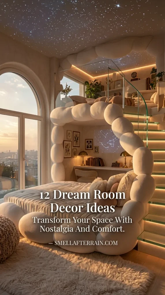
- 1. The Foyer: Establishing the Transition Ritual
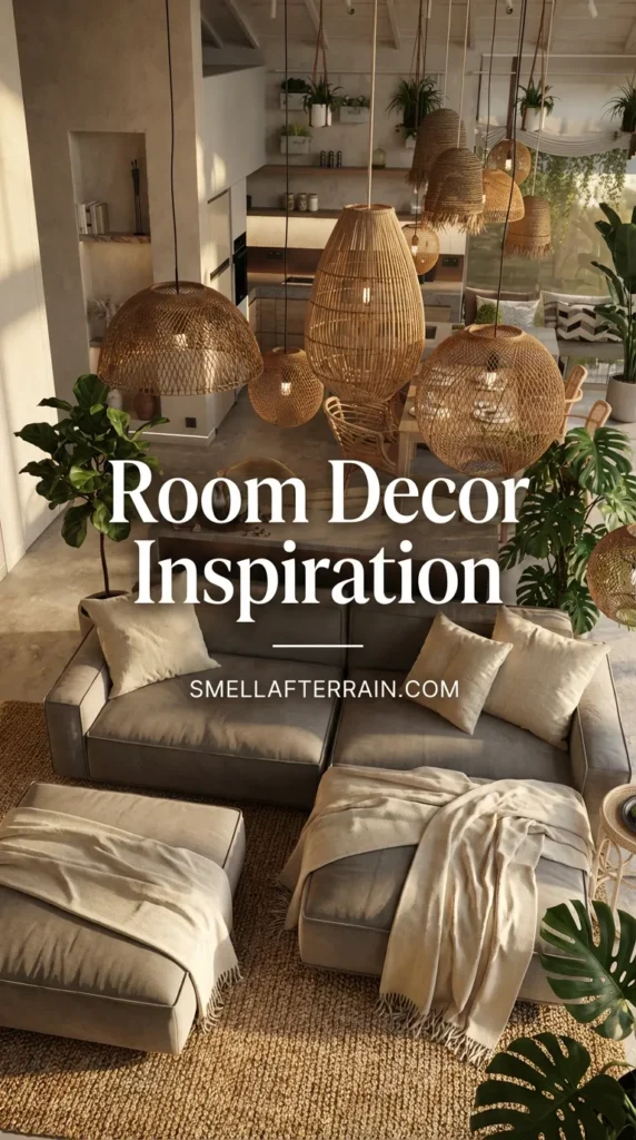
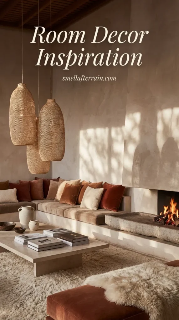
- 2. Lighting as Conversation Architecture
- 3. Heirloom Textures Over Fast Fashion
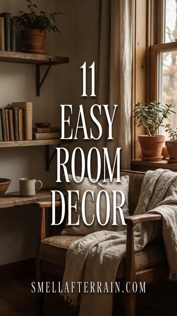
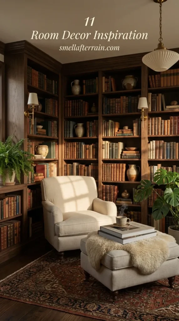
- 4. The Library Aesthetic: Books as Cultural Capital
- 5. The Hospitality Station: Art of the Pour
- 6. Grounding the Space with Heritage Rugs
- 7. Window Treatments: The Jewelry of the Room
- 8. Scentscaping: The Invisible Design Element
- 9. The Floating Layout: Encouraging Intimacy
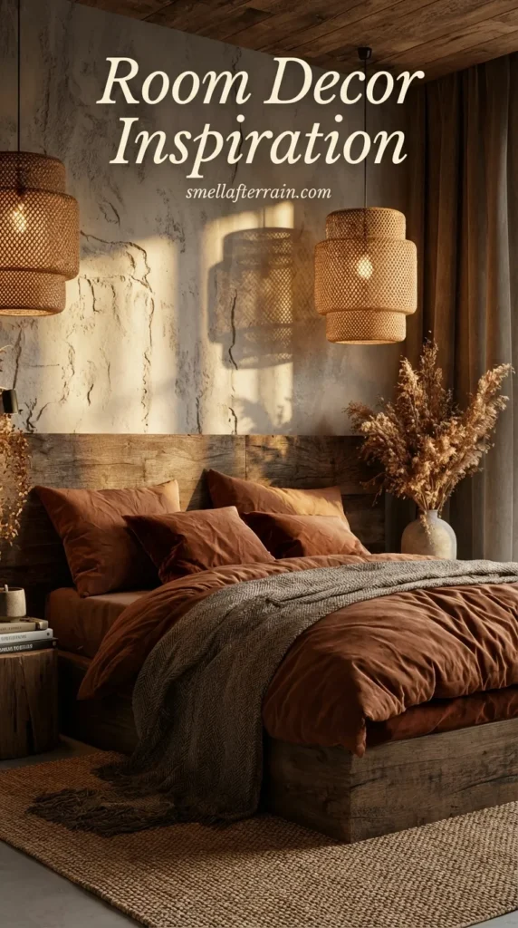
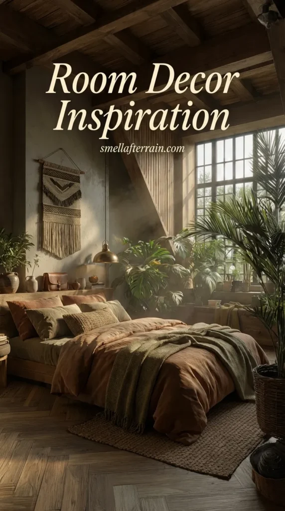
- 10. The Guest Sanctuary: Hotel-Grade Linens
- 11. The Powder Room: A Jewel Box Experience
- Frequently Asked Questions
- Conclusion
Yesterday, hidden behind a stack of chipped, mass-produced ceramic vases at my local thrift shop, I found something heavy. It was a solid brass candlestick, tarnished to a deep, brownish gold, with wax still pooled in the cup.
It wasn’t shiny or perfect. It had scratches that told a story of a hundred dinners.
I bought it immediately. Why? Because it possessed weight and history. Holding it, I realized that true luxury—the kind often associated with the “Old Money” aesthetic—isn’t about brand names. It’s about materials that age gracefully rather than falling apart.
As I walked home, waiting for the sky to darken with the promise of rain, I started thinking about my own space. I have friends coming over this weekend, and I wanted my home to feel not just decorated, but ready to receive them.
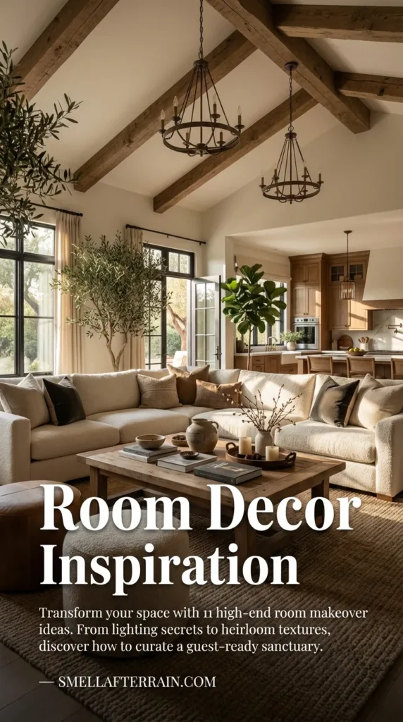
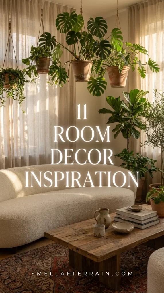
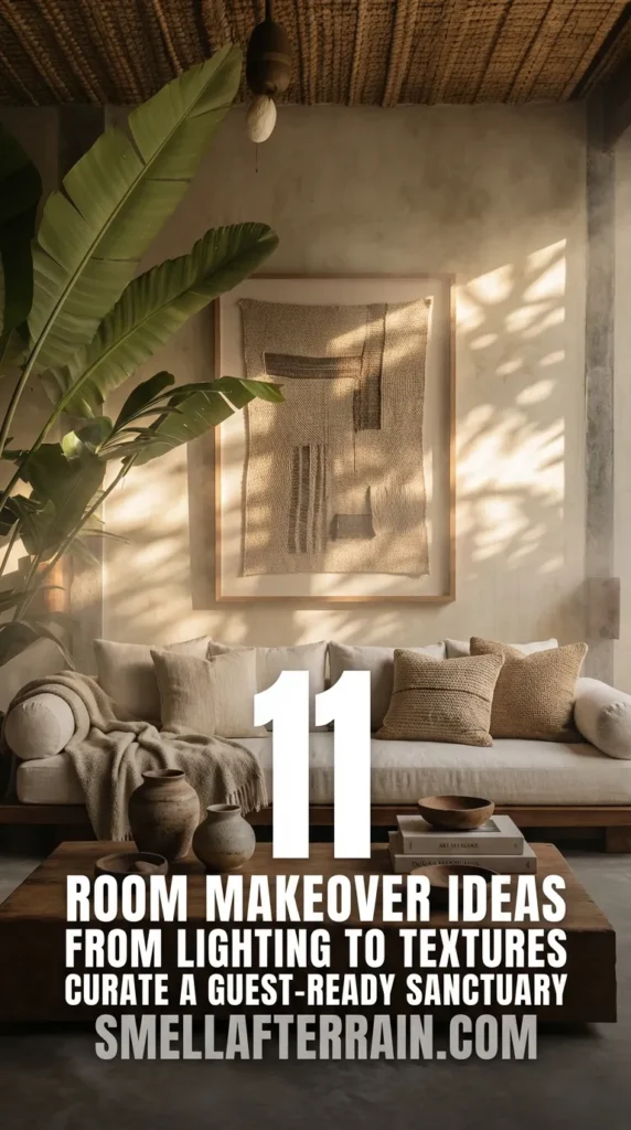
There is a distinct difference between a room that looks good in a photo and a room that feels good to sit in. I want to share my personal collection of calm, high-end design principles that focus on hospitality and investment pieces.
If you are looking for room makeover ideas that elevate your property value and make your guests feel deeply cared for, here is where we begin.
1. The Foyer: Establishing the Transition Ritual
The moment a guest steps through your door, the frantic energy of the outside world should cease. In high-end design, the entryway isn’t just a place to dump keys; it is a transition zone. I view it as a palate cleanser for the senses.
The Psychology of Arrival
When I curated my own entryway, I focused on the sound and the tactile experience. A solid wood console table tells a visitor that this home is grounded. Flimsy particle board wobbles; solid wood waits.
I always ensure there is a specific, designated spot for guests to unburden themselves. It’s a subtle psychological cue. If they have to ask, “Where should I put my coat?” I haven’t done my job. A vintage coat rack or a heavy bronze hook signals that their presence was anticipated.
The Investment Perspective
Focus on flooring here. As I’ve discussed in my broader explorations of timeless room decor principles, the entryway floor takes the most abuse. Natural stone or hardwood that can be refinished adds immense value compared to laminate that must be replaced.
2. Lighting as Conversation Architecture
I used to make the mistake of thinking one big overhead light was enough. I was wrong. In a guest-ready home, lighting is used to sculpt the space and direct conversation.
Overhead lighting is often too harsh, creating unflattering shadows that make guests feel exposed. The goal is a warm, enveloping glow that mimics candlelight. This is often referred to as “Old Money” lighting—it’s never clinical.
The 2700K Rule
I strictly use bulbs with a color temperature of 2700K. This provides a warm, golden light. Anything higher starts to look blue and commercial. I want my guests to look healthy and radiant, not like they are in a dentist’s waiting room.
Layering for Intimacy
I create pools of light. A table lamp on a side table invites a private chat. A picture light over artwork invites contemplation. By leaving the corners of the room slightly in shadow, the center feels cozier and more intimate.
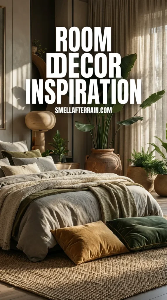
3. Heirloom Textures Over Fast Fashion
My philosophy has shifted entirely from “matching” to “feeling.” When I hunt for fabrics, I close my eyes. Does it feel like a hug? Or does it feel like plastic?
High-end interiors rely on natural fibers: wool, linen, silk, and cotton. These materials breathe. They develop a patina. Synthetic fabrics, while often cheaper, tend to pill and trap odors over time.
The Velvet Touch
I recently added a mohair velvet throw pillow to my sofa. Mohair is incredibly durable and reflects light beautifully. It adds a depth that flat cotton simply cannot achieve.
When you mix textures—a rough boucle against a smooth leather—you create visual interest without needing loud colors. This creates a calm, sophisticated backdrop for conversation. You can find more on this in my guide to creating cohesive living room ideas that prioritize comfort.
4. The Library Aesthetic: Books as Cultural Capital
Nothing kills the vibe of a room faster than empty shelves or shelves filled with generic store-bought decor filler. In the “Old Money” aesthetic, books are not props; they are the soul of the house.
I love reorganizing my bookshelves. I don’t color-code them. I arrange them by subject or size, allowing the chaotic mix of spine colors to create a rich, intellectual tapestry.
Conversation Starters
When guests visit, I want them to be able to pull a book off the shelf and ask me about it. A coffee table book about brutalist architecture or a vintage collection of poetry serves as a prop for connection.
If you have a small corner, you have the potential for a sanctuary. I’ve written extensively about transforming tight spaces into cozy, dedicated book nooks that invite you to stay for hours.
5. The Hospitality Station: Art of the Pour
A host never wants to be stuck in the kitchen while the guests are in the living room. The solution is a dedicated hospitality station or bar cart within the social zone.
This isn’t just about alcohol. It’s about the ritual of serving. Yesterday, alongside that candlestick, I looked for crystal decanters. Even water looks elegant in cut glass.
The Self-Serve Dynamic
I set up a tray with heavy tumblers, a pitcher of water with lemon, and perhaps a spirit or two. This empowers guests to serve themselves. It removes the barrier of them having to ask, “Can I have a drink?”
It makes the room feel inhabited and generous. For those focusing on the heart of the home, this concept translates perfectly to functional kitchen ideas where coffee stations serve the same welcoming purpose.

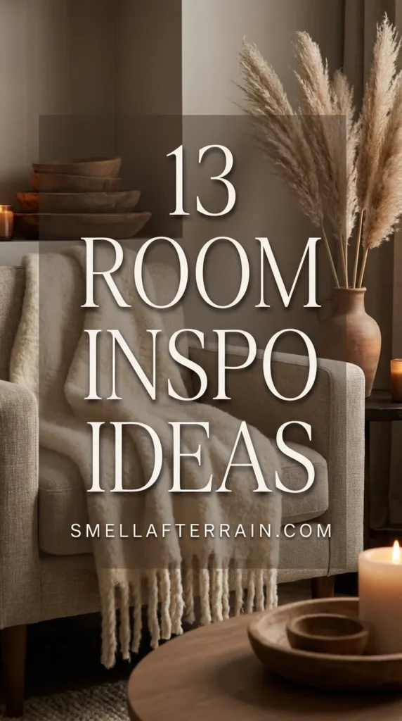
6. Grounding the Space with Heritage Rugs
I used to buy rugs that were too small. It made the furniture look like it was floating away on a raft. A high-end room is anchored by a rug that is generous in size.
The “Legs On” Rule
For a living area, the front legs of all furniture should sit on the rug. Ideally, all legs should be on it. This physically connects the seating pieces, subtly telling your brain, “This is one cohesive zone.”
Material Matters
I advocate saving up for one vintage wool rug rather than buying three synthetic ones over a decade. Wool cleans easier, feels better underfoot, and lasts for generations. A vintage Persian or Turkish rug hides spills beautifully thanks to the intricate patterns—perfect for a relaxed evening with friends.
You can see how different rug textures completely change the vibe in my collection of various rooms and nooks where floor coverings set the tone.
7. Window Treatments: The Jewelry of the Room
If the rug is the shoes, the curtains are the jewelry. Cheap, flimsy blinds lower the perceived value of a room instantly. I always look for heavy drapery that has a liner.
The Height Trick
I hang my curtain rods as high as possible—often just inches below the ceiling cornice—and ensure the rod extends wider than the window frame. This is an old designer trick to make ceilings feel higher and windows feel larger.
The fabric should “kiss” the floor. It shouldn’t flood (too long) or hover (too short). This tailored look screams quality. I prefer linen blends that hold their shape but still look relaxed.
8. Scentscaping: The Invisible Design Element
You cannot see it, but it is the first thing a guest notices. A “stuffy” room feels unwelcoming. But an overly perfumed room feels cheap.
I avoid chemical air fresheners. They sting the nose. Instead, I use what I call “scentscaping.” I boil a pot of water with rosemary and vanilla before guests arrive, or I use a beeswax candle.
The scent should be subtle, like the aftermath of rain—fresh, earthy, and barely there. It anchors the memory of the visit. This philosophy is the very foundation of my approach at Smell After Rain.
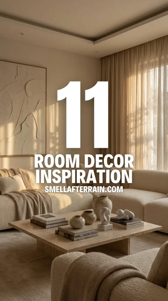
9. The Floating Layout: Encouraging Intimacy
One of the biggest mistakes I see (and used to make) is pushing all the furniture against the walls. It creates a dance floor in the middle of the room that nobody uses.
To create a high-end, conversational atmosphere, I pull the furniture in. I float the sofa in the middle of the room. I place armchairs close enough that you don’t have to shout to be heard.
The Knee Distance
I test my layout by sitting in one chair and imagining a friend in the other. Can we speak softly? Is there a table within reach for both of us to set a drink down? If not, the layout fails the hospitality test.
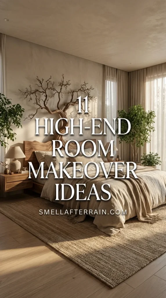
This intimacy is crucial in personal spaces as well. I apply similar layout logic when discussing restful bedroom ideas where flow is essential for relaxation.
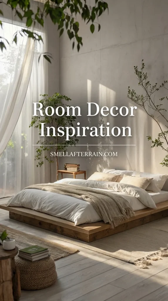
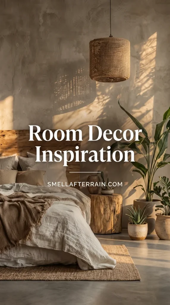
10. The Guest Sanctuary: Hotel-Grade Linens
If a guest is staying overnight, the bed is paramount. The “Old Money” approach to bedding is white, crisp, and cotton. No busy patterns that might clash with a guest’s taste.
The Thread Count Myth
I ignore thread count marketing. Instead, I look for Percale for a cool, crisp feel (like a hotel) or Sateen for a warmer, silkier touch. I always iron the pillowcases. It takes five minutes, but sliding into a bed with crisp pillowcases feels like luxury.
The Hospitality Tray
I place a small tray on the guest bed with fresh towels, a small chocolate, and the Wi-Fi password. It’s a tiny gesture that says, “I prepared for you.” Speaking of towels, the quality of linens extends to the bath, which I cover in my thoughts on spa-like bathroom ideas.
11. The Powder Room: A Jewel Box Experience
Finally, the smallest room in the house often leaves the biggest impression. Because the powder room is small, you can afford to use higher-end materials.
I treat this space like a jewel box. This is where I use the dramatic wallpaper that would be too much for a living room. I swap out the builder-grade faucet for unlacquered brass that will patina over time.
The Vanity Details
I ensure there is a substantial hand towel (no paper towels!) and a high-quality hand soap in a glass dispenser. Plastic bottles destroy the illusion of permanence. I often place a single stem flower in a bud vase here. It’s a quiet surprise for the guest.
Frequently Asked Questions
How can I make my room look expensive on a budget?
Focus on reducing visual clutter and upgrading hardware. Swapping out plastic knobs for solid brass or ceramic ones on a cheap dresser instantly elevates it. Also, ensure your curtains hang from ceiling to floor; this architectural hack adds grandeur without cost.
What is the “Old Money” aesthetic in interior design?
It refers to a style that prioritizes quality, heritage, and comfort over trends. It involves using natural materials like solid wood, wool, linen, and brass—items that look better as they age. It is the opposite of the “fast furniture” culture.
How do I mix patterns without it looking messy?
I stick to a strict color palette (usually three colors) and vary the scale of the patterns. For example, I might pair a large-scale floral rug with a small-scale checkered throw pillow and a solid velvet sofa. The varying sizes keep the eye moving.
What is the most important element for a cozy room?
Texture. A room with flat, smooth surfaces feels cold. Layering knits, wood grain, velvet, and plants creates a sensory experience that our brains interpret as “cozy.” Lighting is a close second—always use warm light.
How do I choose the right size rug for a bedroom?
For a queen or king bed, the rug should extend at least 18 to 24 inches on the sides and foot of the bed. Usually, an 8×10 or 9×12 rug works best. The bed should sit roughly two-thirds of the way onto the rug.
What colors make a room look bigger?
While white is the standard answer, soft neutrals like oatmeal, sage green, or pale blue recede from the eye, making walls feel further away. However, painting a small room a dark, moody color can blur the corners and actually create a sense of infinite depth.
Conclusion
Creating a home that feels like a sanctuary isn’t about spending the most money. It’s about spending time thinking about how you and your guests will live in the space.
As I place my new (old) brass candlestick on the mantle, the heavy metal makes a satisfying clink against the wood. It feels permanent. It feels ready.
Whether you are repainting a wall or just rearranging your books, remember that the goal is to create a backdrop for life’s quiet moments. I hope these ideas help you find your own corner of calm.
Now, if you’ll excuse me, the rain has finally started, and I have a book waiting.